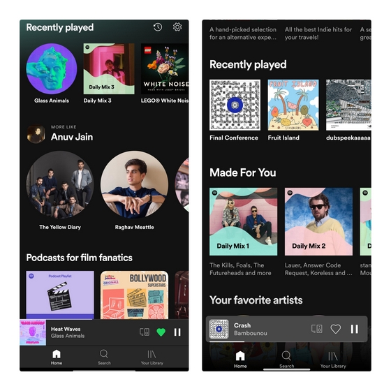
Spotify Redesigned Mini Player UI
As first spotted by the folks over at Android Police, Spotify’s new mini player is rolling out in the stable version of Android. In typical Spotify fashion, the feature is getting a server-side rollout and you may not immediately see it even if you are using the latest version. We have checked on three devices with the latest version of Spotify and it was not live on our end. Judging by the images Android Police shared, one noteworthy change here is the repositioning of the progress bar. While the progress bar was at the top of the mini player before, the redesign shifts it to the bottom. Take a look at the comparison of the old Spotify mini player and the new one below: Image 2 Courtesy: Android Police Interestingly, the mini player now also picks the accent color from the song’s album art. The Home, Search, and Your Library buttons below media player controls have a transparent background. Check out different color variants of the Spotify mini player below, courtesy of Android Police: Image: Android Police For now, we will have to wait for Spotify to make a wider rollout of the feature. To increase your chances of receiving the feature right now, make sure that the Spotify app is updated to the latest version available on Google Play Store. Update Spotify from Play Store

